Across the top of the interface from left to right, we have the Graph Editor, the Console, the SQL Editor, and a section for Help, Servers, and Log tabs.
The Graph Editor allows you to enter in multiple commands separated by a newline and run them all at once by pressing the Execute GSQL button. You can also highlight portions of text and click the Execute GSQL button to only run the selected commands. There is a dropdown menu of example graphs as well as a button to clear the Graph Editor.
The Console allows you to enter in commands one at a time, and it also displays all of the return and error output information for running any command from the Graph Editor or the Console. Similar to the Graph Editor, there is a dropdown menu of example commands and a button to clear the Console.
The SQL Editor allows you to enter and execute SQL queries by hitting the Execute SQL button. You can also highlight portions of text and click the Execute SQL button to only run the selected queries. Again, there is a dropdown menu of example SQL queries and a button to clear the SQL Editor.
The Help tab lists all of the available commands and a short description of what each command does.
The Servers tab displays a tree representation of the master, workers, and the data on each worker.
The Log tab displays the Information, Error, or All Messages logs, depending on the drop down selection. The default is to show All Messages.
Across the bottom from left to right, we have the Visualizer and the Data section.
The Visualizer displays a graph or a line chart when calling certain queries. There is a button that toggles Selector mode, where each vertex will begin pulsing when clicked. There are 1-, 2-, and 3-Hop neighbor buttons to use while interacting with any graph as well. There is a button to expand and collapse the Visualizer and another button which creates SQL WHERE clauses based on the current graph and inputs them into the SQL Editor. There is a button to clear the Visualizer. We will learn more about each button in the next section.
The Data section displays the results from an executed query. There is a button that creates graph commands based on the SQL data table selections and inputs them into the Graph Editor. There is also a button to clear the Data section.
BIG* Data Studio uses the G* Graph Database. This means that in order to use BIG* Data Studio, we must first have a basic understanding of graph theory. Formally, a graph is an ordered pair G = (V, E) comprising a set V of vertices or nodes together with a set E of edges or lines, which are 2-element subsets of V (i.e., an edge is related to two vertices, and the relation is represented as an unordered pair of the vertices with respect to the particular edge). To avoid ambiguity, this type of graph may be described precisely as undirected (Wikipedia).
In short, a graph consists of vertices or nodes with edges or lines connecting them either in a directed or undirected fashion.
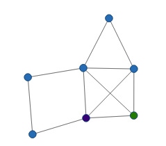
In this tutorial, we will show you how to make this graph:
To create a graph in BIG* Data Studio, we use the syntax add graph <graph-id>. This creates a new graph where the specified graph-id is the name of the graph.
In the console, let's create our first graph:
add graph 0.0
The console will print that it was created successfully:
New graph 0.0 was created.
Note that if the graph-id for your graph is not important, you can use an alternate syntax, new graph or add graph, which will automatically find the next available graph-id to be assigned to the graph you are creating.
Notice that after creating your graph, the active graph label, indicated in the top right corner of BIG* Data Studio, is now set to graph-id 0.0. It was automatically populated with the graph-id of the graph that you just created! To manually set the active graph in BIG* Data Studio, simply use the syntax set active graph <graph-id>.
Now let's mark our new graph as the active graph:
set active graph 0.0
The id of the new active graph will print to the console:
Active Graph: 0.0
It is also important to note that the active graph label in the top right corner of BIG* Data Studio is now the graph-id that was just passed in.
There is currently nothing in the graph you just created. As a result, there is nothing to visualize yet. When we try to draw this empty graph, we will see the following error in the console: Error: No data returned for graph ID 0 and specifier vertices. That is our reminder that we need to add data to our graph before displaying it.
In the example graph we saw above, each circle represents a vertex. For example, your account on Facebook would be a vertex in the Facebook graph. Let's create the first vertex in our new graph!
The syntax to do this is add vertex <vertex-id>. This creates a vertex with name specified by the vertex-id.
Let's add our first vertex:
add vertex 1
The output of the console:
Vertex 1 added to graph 0.0.
To display the graph you created, use the syntax draw. Keep in mind that BIG* Data Studio assumes that you want to draw the graph that is currently the active graph. Again, to identify which graph is currently the active graph, simply check the active graph label in the upper corner of BIG* Data Studio or use the syntax get active graph. However, if you want to specify a different graph, use the syntax draw <graph-id>. This will draw the graph of the specified graph-id.
To see our graph for the first time, execute the command:
draw
The output of the console:
Drawing complete.
Also, the Graph Visualizer of BIG* Data Studio will update and display the contents of the active graph, which is the vertex you created, vertex 1.
Your graph should only have one vertex right now:

We can add attributes to each vertex we create. Attributes can help provide more details to a vertex and to a graph. To update an existing vertex-id with attributes, use the syntax update <vertex-id> with attributes(<attributeName>=<attributeValue>). You can add multiple attributes to a vertex by simply adding a name-value pair for each additional attribute after the first name-value pair. Note that each name-value pair must be separated by a comma.
Attributes can be anything you can think of, but BIG* Data Studio has reserved the attribute color for a special purpose. The color of the vertex, when drawn, will be changed to the color provided in the attributes list! If we add the color attribute, we can recognize our original vertex we created whenever we draw it! Blue is the default color for a vertex in a graph, so we would want to pick another color. In our example, we'll use the color forest green.
Let's add some color:
update 1 with attributes(color=forestgreen)
The output of the console:
Added attribute color
And now draw the graph again to see the updated color of your vertex:
draw
The output of the console:
Drawing complete.
Also, the Visualizer of BIG* Data Studio will now display a vertex with our new color forest green!

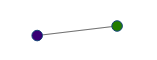
Your Facebook is lonely when you don't have any connections, which is why you add friends. When you make a connection with another person, you are forming a relationship to the other person. The relationship that you create, in graph terms, is an edge between two vertices. One edge joins two vertices together.
Let's create another node. We could use the syntax add vertex <vertex-id>, but let's instead make another vertex that utilizes the attributes capability. We can again use the color attribute, which helps more easily recognize the second vertex whenever it is drawn. The syntax to create a new vertex and immediately add attributes to it is add vertex <vertex-id> with attributes(<attributeName>=<attributeValue>). This time, let's choose the color indigo!
Now we'll add an indigo-colored vertex:
add vertex 2 with attributes(color=indigo)
The output of the console:
Vertex 2 added to graph 0.0.
Next, let's connect both of these nodes with an edge! The syntax is add edge <from-vertex-id>-<to-vertex-id>. This creates an edge from the first vertex-id to the second vertex-id. Visually, an edge is represented as a line connecting two circles.
Let's add an edge between vertex 1 and vertex 2:
add edge 1-2
The output of the console:
Edge from 1 to 2 added to graph 0.0.
Let's see what your graph looks like now! Draw it once more to see the new graph:
draw
The output of the console:
Drawing complete.
Your graph should now have two circles and a line between them. This visually represents the two nodes connected by an edge:
Now that you have some experience working with BIG* Data Studio, let's create the rest of the tutorial graph that was shown above. Start by adding the rest of the vertices needed. The vertices are 3, 4, 5, 6, and 7. Let's have these vertices take on the default coloring when drawn, so we won't add any attributes at this time. They can be updated to have attributes at any time with the syntax update <vertex-id> with attributes(<attributeName>=<attributeValue>).
Remember we use the add vertex <vertex-id> command to add each of the remaining vertices to the graph.
Let's add a few more vertices:
add vertex 3
add vertex 4
add vertex 5
add vertex 6
add vertex 7
After all the vertexes are made, we then need to create all of the edges between the nodes. The edges that need to be made are (1, 5), (1, 6), (2, 3), (2, 5), (2, 6), (3, 4), (4, 5), (5, 6), (5, 7), and (6, 7). Remember we use the add edge <from-vertex-id>-<to-vertex-id> command to add each of the remaining edges to the graph.
Execute the following commands to create the rest of the edges:
add edge 1-5
add edge 1-6
add edge 2-3
add edge 2-5
add edge 2-6
add edge 3-4
add edge 4-5
add edge 5-6
add edge 5-7
add edge 6-7
Once all of the vertices and edges have been made, you can draw the graph! When drawn, it should look similar to the tutorial graph above. It may appear a little different because of the way it is rendered on the page. Let's see what we did:
draw
To view a summary of the graph you just created, which provides the number of vertices and edges within the given graph-id, use the syntax get graph <graph-id>.
Let's check the summary out:
get graph 0.0
The output of the console:
Graph 0.0:
 Vertices: 7
 Edges   : 11
To view an unordered list of the vertices in the graph you just created, use the syntax get vertices <graph-id>. However, since the active graph is currently set to our new graph, we can just use the syntax get vertices. The syntax will use the active graph's graph-id to get the vertices.
Let's grab all of our vertices:
get vertices 0.0
The output of the console:
The vertex list for 0.0 is: 4, 1, 5, 2, 6, 3, 7
Keep in mind that the order of the vertices in the vertex list is random, so the output may be slightly different.
Alternately, to view the unordered list of the vertices in the graph, along with any attributes that the vertices may have, use the syntax get attributes <graph-id>. Or, if you know that the active graph is set, you can just use the syntax get attributes. All of the vertices will be displayed again, but any vertex that has attributes will display the attribute pairs as well.
Now check out the attributes:
get attributes 0.0
The output of the console:
The vertex list with their attributes for 0.0 is: (vertex:4), (vertex:1,color:forestgreen), (vertex:5), (vertex:2,color:indigo), (vertex:6), (vertex:3), (vertex:7)
As mentioned before, the order of the vertices in the vertex list is random, so the output might be slightly different.
Similarly, to view the edges in the graph you just created, which will appear as an unordered list of pairs, use the syntax get edges <graph-id>, or since the active graph is currently set to this graph we are creating, you can use the syntax get edges and the active graph's graph-id will be used to get the vertices.
Let's view the edges for our graph:
get edges 0.0
The output of the console:
The edge list for 0.0 is: (3, 4), (2, 3), (5, 7), (6, 7), (1, 2), (1, 6), (2, 6), (5, 6), (1, 5), (2, 5), (4, 5)
Again, the output may be slightly different since the order of the pairs in the edge list is random.
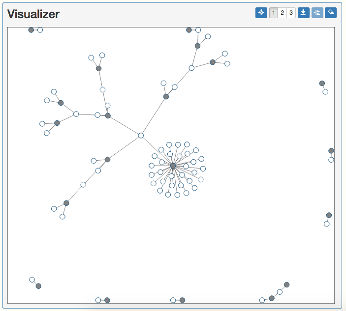
As you can see, the more connections you make, the larger the graph becomes. Here is an example of a Facebook graph. There are are many relationships denoted by vertices connected by an edge. There are cliques that form from these relationships, which show a group of friends from the same hometown since every person is connected to each other.
You can also use the Graph Editor to create and manipulate the example graph instead of using the Console like you learned above. The Graph Editor accepts the same commands that the Console does and will execute each line in order. Go ahead and try it yourself by following the tutorial again or by copying and pasting the following code into the Graph Editor. Note that the graph-id below is different from the graph-id from above since we've already used the previous graph-id.
add graph 1.0
add vertex 1
update 1 with attributes(color=forestgreen)
add vertex 2 with attributes(color=indigo)
add edge 1-2
add vertex 3
add vertex 4
add vertex 5
add vertex 6
add vertex 7
add edge 1-5
add edge 1-6
add edge 2-3
add edge 2-5
add edge 2-6
add edge 3-4
add edge 4-5
add edge 5-6
add edge 5-7
add edge 6-7
draw
Or click here to paste the above text into the Graph Editor.
Now what? We've created and drawn a graph. Let's run queries it now!
Let's start with a query called Top-K Degrees. This query identifies the top k number of vertices in the graph based on their respective degree. For example, let's manually calculate the result of a the Top-K query with a k-value of 1. In other words, this query can be understood as the one vertex that connects to the most vertices. To figure out this query's result, first pick a vertex and count how many edges are connected to it. That number is the current vertex's degree. After all of the degrees are calculated for each vertex, we need to sort all of the vertices by their degree. Since our k-value is 1, the vertex with the highest degree is our result. On the other hand, a Top-K Degrees query with a value of 2 would return the two vertices that had the first and second highest degree values. To programmatically calculate the Top-K query, we can use the syntax query topkdegrees <k>.
Let's calculate the Top-K Degrees query with a k-value of 3.
query topkdegrees 3
The console will return:
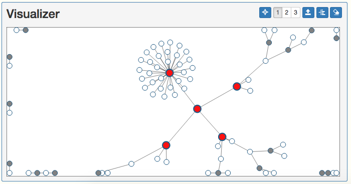
Drawing complete.
The graph will be redrawn in the Visualizer with the k number of vertices colored in red. The vertices will also continuously pulse, which indicates the Top-K query results until the graph is redrawn or another query is run.
There is output in the text area of the Data section as well:
top 3 vertices by total degree: 5,2,6
Another query to calculate with our graph is the graph's degree distribution. To do so, we need to take each vertex and count how many edges are connected to it. The result is the degree value for each vertex. Each degree value is then matched up with how many vertices have that degree. To calculate the degree distribution query, we need to use the syntax query degreedistribution <graph-id>. Alternatively, when using the active graph-id, use the syntax query degreedistribution.
Let's find the degree distribution our graph:
query degreedistribution 0.0
The output of the console:
Drawing complete.
The data section:
Degree distribution:
total_degree , count
2 , 3
3 , 1
4 , 2
5 , 1
This means that there are 3 vertices with a degree of 2, 1 vertex with a degree of 3, 2 vertices with a degree of 4, and 1 vertex with a degree of 5.
The graph in the Visualizer will be replaced by a line chart, where the y-axis represents the number of vertices and the x-axis represents the degree value. The points (2,3), (3,1), (4,2), and (5,1) are plotted and connected by a line. Each point can be understood in the following way: There are <y-value> vertices with a degree of <x-value>.
Aside from running these queries through the Console, you can also use the Visualizer to query vertex neighbors based on hop count. First, draw our graph with the command draw so that the line chart in the Visualizer is replaced by the graph. Now, click any vertex. That vertex will be colored red. You'll notice green vertices that are directly connected to the selected vertex. Any vertex that shares an edge with the clicked vertex is a 1-hop neighbor.
To determine all 1-hop and 2-hop neighbors, click the button with the number 2 in the upper right corner of the Visualizer. Now, click the red vertex (or the selected vertex). You will again see the 1-hop neighbors in green, but now you will also see vertices colored yellow, which are the 2-hop neighbors. That means that from the selected vertex, you can reach any other vertex that is directly connected to any 1-hop neighbor. So, it takes 2 hops to get from the clicked vertex to any yellow vertex.
The same applies when you click the button labeled 3 in the upper right corner of the Visualizer. In addition to the 1-hop and 2-hop neighbors, any 3-hop neighbor of the selected vertex will be colored orange. In our graph, the only 3-hop neighbor relationship is between vertex-id 3 and vertex-id 7.
This is what the graph should look like when the 3-hop neighbor button is selected and the vertex with the vertex-id 3 is selected:

In addition to the graph coloring within the Visualizer, the output of querying vertex neighbors based on hop count is printed in the text area of the Data section. When clicking vertex 3, the Data section for 1-hop neighbors will return 1-hop neighbors of vertex 3: 4,2, the Data section for 2-hop neighbors will return 2-hop neighbors of vertex 3: 4,2,5,1,6, and the Data section for 3-hop neighbors will return 3-hop neighbors of vertex 3: 4,2,5,1,6,7>.
You've made it through the tutorial! Now that you have a basic understanding of how to use BIG* Data Studio, you can apply all of the features and functionality to your own work! An example of a real-world use case for BIG* Data Studio can be seen in the healthcare industry. You can use BIG* Data Studio to store and represent Doctor/Patient/Pharmacy relationships visually, as well as run queries based upon the given relationships.
If you would like to learn more about how to integrate the use of the graph database G* and the SQL functionality included in BIG* Data Studio, continue on to the Advanced Tutorial! But first, check out some other features of BIG* Data Studio!
If BIG* Data Studio is getting filled up with text there are ways to clean it up. You can use the command clear in the Console or click the eraser button in the upper right hand corner of the Console. If you want to clear the the Graph Editor, the Visualizer, or the Data section of BIG* Data Studio, click the eraser button in the upper right hand corner of the that section.
Try typing ver, version, get ver, or get version into the Console (or Graph Editor). It will display the current versions of BIG* Data Studio and the G* Graph Database.
Try typing get time into the Console (or Graph Editor). It will display the current time as well as an elapsed time, which is the duration in seconds since the time command was run previously. This is helpful when determining how long it takes to execute a query or a series of commands. For example, to time several commands, first call the time command, follow it immediately with the commands to be executed, and finally call the time command once more. Now, the elapsed time will represent how long it took to execute the list of commands.
To find out what graphs already exist, and how many vertices and edges the graphs have, enter get graphs into the Console (or the Graph Editor). It will return a graph-id with its associated vertices and edges for every graph that exists. This is useful for identifying certain graphs based on their number of vertices or edges or to figure out the next available graph-id.
There are two ways to find out which workers are being controlled by the master to execute your commands. First, we can execute the command get workers. This returns a list of workers, showing each worker's ID, IP address, and port. Alternatively, you can use BIG* Data Studio's GUI to find out the same information about the workers. Click on the Server tab in the shared Help, Server, Log section of BIG* Data Studio. Here, you'll find a collapsable tree, which displays the workers available to the master, and provides the IP address and port that the worker is running on.
To see the log information while working with BIG* Data Studio, click on the Log tab in the shared Help, Servers, Log section. Here, you'll find a table that displays the output of all messages that have occurred. You can use the dropdown to switch between viewing Informational Messages, Error Messages, or the combined list of both called All Messages.
If you want to clone a graph, you will need to create a new graph based on a graph that already exists. To do so, use the syntax clone <graph-id> from <graph-id>. An example would be clone graph 2 from 1, which is saying to create a new graph with graph-id 2.0 using all of the data from the existing graph with the graph-id 1.0. This is useful to observe changes and trends in a graph, based on the changes in the number of vertices and edges. For example, this can be used to observe social media interactions, such as relationships that are added or new users who join over a given span of time, and as the graph-id increases, the time elapsed also increases.
To query the cloned graphs, you can use the built in graph query called Top-K Degree Changes by Delta. The syntax is query topkdegreechangesbydelta <start-graph-id> <stop-graph-id> <k>. This will query the top k number of vertices with the largest change in degree over consecutive graph snapshot pairs as the graph-id goes from <start-graph-id> to <stop-graph-id>.
There are example graphs provided within the Graph Editor section, which you can find in the dropdown menu in the upper right corner of the section. Clicking an example graph will populate the text in the Graph Editor that will create the graph. You may need to make minor tweaks if necessary. For example, if you already have a graph assigned to the same graph-id as an example graph is trying to use, be sure to change the graph-id value. Then, click the GSQL button and all of the commands will run and display output as if they were entered into the Console individually.
There are example queries provided within the SQL Editor section, which you can find in the dropdown menu in the upper right corner of the section. Clicking an example query will populate the text in the editor that will run the query against the database. Then, click the SQL button and the results will appear in the table of the Data section.
In the upper rightmost corner of BIG* Data Studio, there is an indicator that visually represents the connection status to the G* Graph Database. The indicator is yellow while BIG* Data Studio is running the check to determine if it can reach the G* Graph Database. The indicator is red when the check fails and BIG* Data Studio cannot reach G* Graph Database. The indicator is green when the check succeeds and BIG* Data Studio is able to reach the G* Graph Database. As long as the indicator is green, everything is online and accessible!
Let's get started with the advanced tutorial! This exercise uses all of the key features of BIG* Data Studio. In fact, this is how we demo the system, and we recommend using this example when showing off BIG* Data Studio to others!
First, let's use the SQL Editor and the recommended example SQL queries. Behind BIG* Data Studio, there is a PostgreSQL database. We have some example tables in our instance of PostgreSQL to play with for this tutorial.
Next, let's look at the query called Doctors/Patients Graph Example. Go to the dropdown selector in the SQL Editor. Click on the dropdown, select Pharma, and then choose Doctors/Patients Graph Example. A query will populate in the SQL Editor:
SELECT 'doctor' as doctor,
  d.did,
  ' is treating ' AS is_treating,
  p.pid,
  ' for feeling ' AS for_feeling,
  t.symptom
FROM testDoctors    d,
     testPatients   p,
     testTreatments t
WHERE t.did = d.did
  AND t.pid = p.pid
ORDER BY did ASC, pid ASC
To run this query, click the Execute SQL button.
Now, BIG* Data Studio will communicate with the PostgreSQL database and return a table of rows and columns based on the query. The bottom of the SQL Editor will update to reflect the number of rows returned (i.e., 74 rows), and the rows themselves will appear in the Data section, replacing the empty table with the results of the query.
In a tabular form, this data is useful, but now that we have a graph visualizer, let's turn these rows and columns into a graph!
Next, simply click the To Graph Editor button, and BIG* Data Studio will automagically turn the data from the selected columns into commands to build a graph. If you completed the starting tutorial, then you should be able to understand everything that was populated into the Graph Editor. If not, refer to the previous tutorial and the Help section to understand the commands that the To Graph Editor button populated into the Graph Editor.
Now that all of the commands are entered into the Graph Editor, click the Execute GSQL button. The Graph Editor will run every command in order, of which the output will display in the Console. Follow along with the console output, or once the Console stops printing success messages, all of the commands in the Graph Editor will be completed. The final printed success message will be Checkpoint succeeded.
Since the Graph Editor commands set the active graph to our new graph we just created, use the syntax draw in the Console and the graph we just created from the SQL query will appear in the Visualizer! You may wish to expand the Visualizer, since this graph contains many vertices and might appear cluttered in the normal sized Visualizer.
You could stop here and understand how to integrate SQL into BIG* Data Studio, but we can do so much more now that we've gotten to this point!
Take a look at this graph you've created. There are all kinds of relationships happening between doctors and patients. There are doctors with many patients, doctors with a few patients, patients with multiple doctors and every other combination you can think of! This is useful, but let's find out who are the most influential people in this graph, meaning which nodes have the most connections!
First, let's look at the distribution of degrees so we can decide how many influential people there are. In the Console, run the Degree Distribution query on the graph:
query degreedistribution 1.0
The output of the console:
Drawing complete.
The data section:
Degree distribution:
total_degree , count
1 , 65
2 , 5
3 , 8
4 , 3
5 , 1
32 , 1
For the output in the data section, the results show that there are 65 vertices with a degree of 1, 5 vertices with a degree of 2, 8 vertices with a degree of 3, 3 vertices with a degree of 4, 1 vertex with a degree of 5, and 1 vertex with a degree of 32.
The graph in the Visualizer will be replaced by a line chart, where the y-axis represents the number of vertices and the x-axis represents the degree value. The points (1,65), (2,5), (3,8), (4,3), (5,1), and (32,1) are plotted and connected by a line.
Since there are fewer people with more connections, let's try counting the number of vertices from the top three total degree amounts. That means look at 3 vertices with a degree of 4, 1 vertex with a degree of 5, and 1 vertex with a degree of 32. Adding the number of vertices from these three pairs means we will want to look for the top 5 most influential people.
Now, let's use the Top-K Degrees query. The Top-K Degrees query uses the syntax query topkdegrees <k>, where k is the number of influential people we want to find for this graph. We learned from the Degree Distribution query that there are 5 very influential people in this graph. We will set k to 5 and run this query:
query topkdegrees 5
The output of the console:
Drawing complete.
The graph will be redrawn in the Visualizer, with the k number of vertices colored in red. The vertices will also pulse to continuously indicate the Top-K query results until the graph is redrawn or another query is run. The Data section will display top 5 vertices by total degree: doctor.1, doctor.33, doctor.2, doctor.4, patient.0 as well.
As expected, most of the top influential people are doctors. Doctors typically see more than one patient, so that would cause them to have more relationships, as opposed to the opposite where a patient sees more than one doctor. However, there is one influential person that is a patient. Patient 0, patient.0 in our graph, is connected to four different doctors.
Let's exaggerate for a moment and pretend Patient 0 has been experiencing unusual symptoms that just one doctor couldn't figure out how to cure. Patient 0 made an appointment with Doctor 4 and after receiving inconclusive results, he decided to set up another appointment with a different doctor, Doctor 2. By the end of that appointment, Doctor 2 recommends another appointment to see Doctor 33 for more help. By the time of his appointment, his health was really dwindling. Patient 0 finally saw Doctor 33, who helped with some symptoms but ultimately recommended Doctor 1, the best doctor in the area, to try and help cure Patient 0. Under his care, Patient 0 was taken into Doctor 1's office and eventually brought into an isolation room. Doctor 1 was worried about the disease that Patient 0 may have and tried to contain the patient to avoid spreading the disease. Since our graph maps out Patient 0 and the doctors that Patient 0 came in contact with while carrying the disease, we can use BIG* Data Studio to locate and isolate any potential victims due to their doctors being in direct contact with Patient 0.
We want to identify any at-risk persons based on neighboring relationships. With Patient 0 as our first victim, we need to look for the neighboring people that he first came in contact with directly. This is represented by any 1-Hop Neighbors or direct connections to Patient 0. To view these neighbors, click on the 1-Hop Neighbors button and then click on Patient 0 (patient.0) in the graph.
The graph will update node colors and represent the root node, Patient 0, in red and all of Patient 0's direct connections in green. Those direct connections are Doctors 4, 2, 33, and 1. We expected this since Patient 0 visited all four doctors to get his symptoms checked.
Because this disease is unknown, we can only play it safe by looking for anyone who was in contact with the direct connections, basically anyone who has come in contact with the four Doctors after Patient 0 arrived. That would be represented by any 2-Hop Neighbors from Patient 0. To view these neighbors, click on the 2-Hop Neighbors button and then click on Patient 0 (patient.0) in the graph.
The graph will update node colors to include the 2-Hop Neighbors in yellow.
In case any of these 2-Hop Neighbors, the other patients that each doctor has seen since Patient 0, have felt any symptoms and decided to contact an additional doctor that the known doctors, we also want to contact any 3-Hop Neighbors of Patient 0. To view these neighbors, click on the 3-Hop Neighbors button and then click on Patient 0 (patient.0) in the graph.
The graph will update node colors to include the 3-Hop Neighbors in orange.
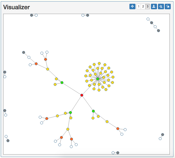
We have now identified anyone who could potentially become a victim to the disease. Now, we want to notify all involved Doctors and Patients of the situation, so we want to provide a more specific table of results as well as a newly drawn graph, focusing in on those who may be infected. We can do this based on the results from finding the 3-Hop Neighbors. While 3-Hop Neighbors are still identified on the graph, press the To SQL Editor button in the top corner of the Visualizer.
A SQL WHERE clause will appear at the bottom of the SQL Editor, which includes all of the vertices that were highlighted while looking at the 3-Hop Neighbors in the Visualizer. Now all we need to do is add this WHERE clause into the original SQL Query, Doctors/Patients Graph Example, which is still in the SQL Editor from when we first ran it. Before we merge the new clause into the query, we need to make a few changes to the WHERE clause that was created. First, update anywhere with brackets surrounding the alias to the actual table and column name that applies (t.did for [doctor] and t.pid for [patient]). Second, since the 3-Hop Neighbors list is only listing out the neighbors, and Patient 0 is the source vertex and not a neighboring vertex, we will need to add Patient 0 (t.pid = 0) to the vertex list for patient ID's. Last, since the SQL query already has a line with the word WHERE, each line of the new parts of the clause should no longer be WHERE or OR, but instead be AND. After these updates are made to the inserted clause, it can be merged together. The resulting SQL query should look like this:
SELECT 'doctor' as doctor,
  d.did,
  ' is treating ' AS is_treating,
  p.pid,
  ' for feeling ' AS for_feeling,
  t.symptom
FROM testDoctors    d,
     testPatients   p,
     testTreatments t
WHERE t.did = d.did
  AND t.pid = p.pid
  AND t.did IN (1,2,33,4,8,12,9,6,11,39)
  AND t.pid IN (0,10,14,18,21,25,43,5,54,
 	9,11,15,19,2,44,51,59,6,
	17,20,24,28,31,4,42,60,
	12,27,3,30,41,7,33,35,8,
	47,62,46,49,50,53,38)
ORDER BY did ASC, pid ASC
Now that you have the updated SQL query to identify individuals who may be infected because of neighboring contact with Patient 0, click the Execute SQL button at the bottom of the SQL Editor.
After communicating with the PostgreSQL database, the table in the Data section will update to now only include the desired 51 rows, based on our narrowed view of the original query. Now we have a table of rows and columns to distribute including the possibly infected patients and doctors. But this is again, difficult to visualize. Let's make another graph based on this updated query so that during the distribution of data to contact and contain the victims, there can be an easier visual representation to denote how close to the source of contact the specific victim is to Patient 0, and how critical, based on hop count, their risk of infection is.
To make a graph out of the results in the table, we need to do the previous steps again.
We will again select two columns to use as nodes in the graph. Click the checkboxes that are within the cell with column names did and pid. Let's do the same alias and color selections from before, so make the alias doctor and the color Gray for column did, and let's make the alias patient and the color White for column pid.
Now click the To Graph Editor button, the commands to build the new graph will be populated into the Graph Editor. Click the Execute GSQL button and allow BIG* Data Studio to create the new graph.
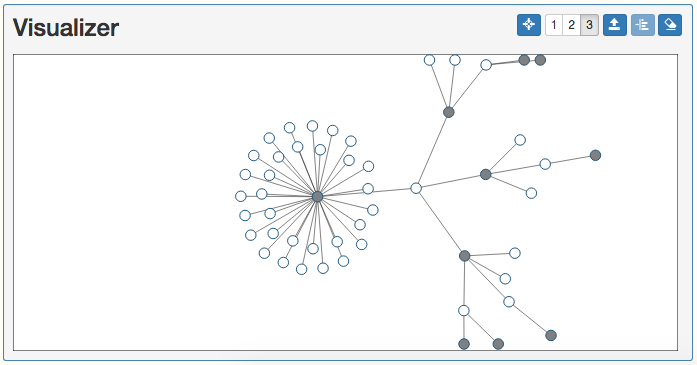
Once completed, use the syntax draw in the Console and the new graph we just created will appear in the Visualizer! As you can see, only the 3-Hop Neighbors and source Patient 0 vertices and edges are a part of this graph. All other doctors and patients were removed because of the query updates.
Now we have the graph of the potentially infected people! If we use the 3-Hop Neighbors button and click Patient 0 again in the Visualizer, we can use this colored graph to illustrate the risk of infection with the node coloration. Red coloring, the source, definitely has the disease, while green coloring, the 1-Hop Neighbors, are at a high risk, yellow coloring, the 2-Hop Neighbors, are at a medium risk, and orange coloring, the 3-Hop Neighbors, are at a low risk of becoming infected from the disease.
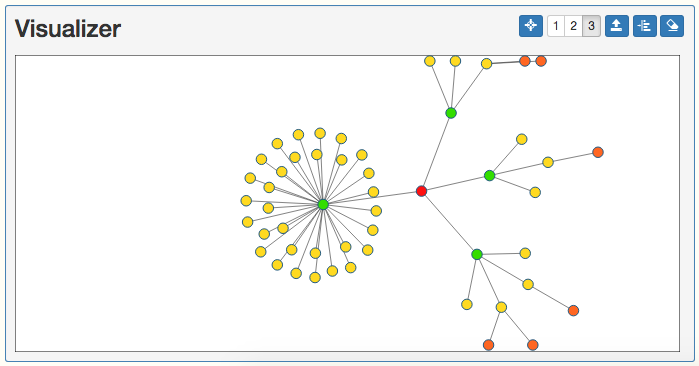
There we have it! We have created detailed summary including table and graph data based around the disease Patient 0 may have and anyone who came in direct or indirect contact with Patient 0. This would be helpful to contain the potentially infected people and prevent an epidemic, as well as begin studying the disease to search for the cause and a cure!
Of course, this was just an example of the capabilities of BIG* Data Studio! There are many ways to utilize BIG* Data Studio for any situation, so get out there and start graphing!
You've completed the advanced tutorial! You now have an even better and more thorough understanding of how to use BIG* Data Studio!
The BIG* Data Studio team would love to hear how you are utilizing BIG* Data Studio. Contact us anytime at gstar@email.address. We'd love to hear your feedback and use cases! Thanks!